前端基础
前端基础
Helper工具类
TableHelper
TableHelper抽取了表格组件中的通用变量pageData(分页结果), queryRequest(分页请求), tableSelectedRows(已选数据), loading(v-loading), table(ElTable实例)。除了通用的变量外还有通用的方法。
import {ElTable} from 'element-plus'
import {type Ref, ref} from 'vue'
import type {Page, QueryRequest} from '@/api/__generated/model/static'
import _ from 'lodash'

export type PageResult<T> = Pick<
    Page<T>,
    'content' | 'number' | 'size' | 'totalElements' | 'totalPages'
>

export const useTableHelper = <T extends Object, E>(
    // 调用后端的查询接口
    queryApi: (options: { readonly body: QueryRequest<T> }) => Promise<PageResult<E>>,
    object: unknown,
    // 查询条件
    initQuery?: T,
    // 分页数据后置处理
    postProcessor?: (data: PageResult<E>) => void
) => {
    const pageData = ref({
        content: <E>[],
        number: 0,
        size: 0,
        totalElements: 0,
        totalPages: 0
    }) as Ref<PageResult<E>>
    const queryRequest = ref({
        query: initQuery ?? {},
        pageNum: 1,
        pageSize: 10,
        likeMode: 'ANYWHERE',
        sorts: [{property: 'createdTime', direction: 'DESC'}]
    }) as Ref<QueryRequest<T>>
    const loading = ref(false)
    const tableSelectedRows = ref([]) as Ref<E[]>
    // ElTable实例
    const table = ref<InstanceType<typeof ElTable>>()

    // 请求分页数据
    const loadTableData = (request: Partial<QueryRequest<T>>) => {
        queryRequest.value = {
            ...queryRequest.value,
            ..._.omitBy(request, _.isNull)
        }
        queryRequest.value.query = {..._.omitBy(queryRequest.value.query, _.isEmpty)} as T
        loading.value = true
        queryApi.apply(object, [{body: queryRequest.value}]).then(
            (res) => {
                if (postProcessor !== undefined) {
                    postProcessor(res)
                }
                pageData.value = res
                loading.value = false
            },
            (res) => {
                console.log(res)
            }
        )
    }
    // 重新请求分页数据,pageNum=1, pageSize=10
    const reloadTableData = (
        queryRequest: Partial<QueryRequest<T>> = {pageNum: 1, pageSize: 10}
    ) => {
        loadTableData(queryRequest)
    }
    // 获取表格选中的数据
    const getTableSelectedRows = () => {
        return tableSelectedRows.value
    }
    // 当表格选择变动时更新选中的数据
    const handleSelectChange = (selectedRows: E[]) => {
        tableSelectedRows.value = selectedRows
    }
    const handleSortChange = ({
                                  prop,
                                  order
                              }: {
        prop: string
        order: 'ascending' | 'descending'
    }) => {
        const directionMap: { ascending: 'ASC'; descending: 'DESC' } = {
            ascending: 'ASC',
            descending: 'DESC'
        }
        const sorts = queryRequest.value.sorts
        sorts[sorts.length - 1]['direction'] = directionMap[order]
        sorts[sorts.length - 1]['property'] = prop
        reloadTableData()
    }

    return {
        table,
        loading,
        queryRequest,
        tableSelectedRows,
        pageData,
        loadTableData,
        reloadTableData,
        getTableSelectedRows,
        handleSortChange,
        handleSelectChange
    }
}
DialogHelper
DialogHelper将Dialog通用的变量抽取出来,每次新建一个Dialog时只需要调用useDialogHelper就可以快速写出一个对话框。
export const useDialogHelper = () => {
    const dialogData = reactive<{ width: number; title: string; visible: boolean; mode: EditMode }>({
        width: 1200,
        title: '',
        visible: false,
        mode: 'CREATE'
    })
    const closeDialog = () => {
        dialogData.visible = false
    }
    const openDialog = async (mode?: EditMode) => {
        if (mode !== undefined) {
            dialogData.mode = mode
        }
        await nextTick()
        dialogData.visible = true
    }
    return {dialogData, closeDialog, openDialog}
}
queryHelper
queryHelper抽取查询表单的通用变量和方法。辅助Query编写组件。
export const QueryHelper = <T>(initQuery: T) => {
    const queryData = ref({query: initQuery, matchMode: 'VAGUE'}) as Ref<{
        query: T
        matchMode: MatchMode
    }>
    const restQuery = () => {
        queryData.value.query = {...initQuery}
        queryData.value.matchMode = 'VAGUE'
    }
    return {queryData, restQuery}
}
左右联动菜单
搭建基本的结构,左侧(left-scroll)用于存放类别(category-section),右侧(right-scroll)用于存放商品(product-section)。类别区域中有多类别(category-item),每个类别呈左右结构(icon)和(name)。
样式
<script lang="tsx">
  import {PropType, SlotsType, defineComponent} from "vue";
  import {ScrollView} from "@tarojs/components";
  import {Product, ProductCategory} from "@/typings";

  export default defineComponent({
    name: "CategoryProducts",
    props: {
      categories: {
        type: Array as PropType<ProductCategory[]>,
        required: true,
      },
    },
    slots: Object as SlotsType<{
      default: { product: Product };
    }>,
    setup(props, {slots}) {
      return () => (
          <div class="side-menu">
            {/* 左右结构left-scroll和right-scroll */}
            {/* scrollY: 可以在垂直方向上滚动。必须指定hight的值。 */}
            <ScrollView
                class="left-scroll"
                scrollY={true}
                scrollWithAnimation={true}
            >
              {/* 左侧存放类别,所有类别垂直排列,且在水平居中 */}
              <div class="category-section">
                {props.categories.map((category) => (
                    // 每个类别左边是图标,右边是类别名字。且图标和名字垂直/水平居中。
                    <div class="category-item" key={category.id}>
                      <div class="name-icon">
                        {category.icon ? (
                            // mode={"aspectFill"} 优先保证图片的比例,无法显示的部分会截切掉。
                            <image
                                src={category.icon}
                                class="icon"
                                mode={"aspectFill"}
                            ></image>
                        ) : (
                            ""
                        )}
                        <div class="name">{category.name}</div>
                      </div>
                    </div>
                ))}
              </div>
            </ScrollView>
            <ScrollView
                class="right-scroll"
                scrollY={true}
                scrollWithAnimation={true}
            >
              <div class="product-section">
                {props.categories.map((category) => (
                    // 每个类别对应多个商品
                    <div class="category-products">
                      <div class="category-name">{category.name}</div>
                      <div class="product-wrapper">
                        {/* 商品插槽,商品的样式比较动态,留给引用方实现。 */}
                        {category.products.map((product) => (
                            <div>{slots.default({product})}</div>
                        ))}
                      </div>
                    </div>
                ))}
              </div>
            </ScrollView>
          </div>
      );
    },
  });
</script>

<style lang="scss">
  .side-menu {
    display: flex;

    .left-scroll {
      height: 100vh;
      width: 150px;

      .category-section {
        // 类别区域内的类别垂直排列且水平居中
        display: flex;
        flex-direction: column;
        align-items: center;

        .category-item {
          // 类别的图标和名字的相关样式。
          display: flex;
          padding: 50px 0;
          align-items: center;
          justify-content: center;
          width: 100%;

          .name-icon {
            display: flex;
            align-items: center;

            .icon {
              width: 40px;
              height: 40px;
              margin-right: 10px;
              border-radius: 50%;
            }
          }

          &.active {
            background-color: white;
          }
        }
      }
    }

    .right-scroll {
      height: 100vh;
      width: 600px;

      .product-section {
        background-color: white;
        padding: 15px;

        .category-products {
          .category-name {
            padding: 20px 0;
            font-size: 32px;
            color: rgba(#000, 0.8);
          }
        }
      }
    }
  }
</style>
数据初始化
想要实现点击左侧类别时,让右侧的区域滚动到该类别商品所在的位置那必然需要知道每个category-products顶部与right-scroll的距离。然后才能控制滚动条移动到相应的位置。
在右侧滚动时,也需要知道当前的商品是属于哪个类别,让左侧的类别也跟着滚动。要实现这个功能需要知道category-products顶部和底部与right-scroll的距离,这样可以知道滚动条落在哪个区间,通过区间可以反推出是属于哪个类别。
现在有三个区间:[0,100],[101,300],[300,350]。每个区间代表category-products的顶部和底部与right-scroll的距离。每个区间同时也对应一个类别。0:果茶,1:咖啡,2:奶茶。当前滚动条所在位置是200,遍历区间发现当前滚动条在[101,300]这个区间,反推得知当前区间对应的类别是咖啡。为了节流还需要知道right-scroll的高度。假设right-scroll的高度是100px,product-section的高度是300px。当滚动条滚动到200px时其实就已经到达底部了,因为200px+100px=300px。通过这个计算公式可以提前停止滚动,防止出现滚动抽搐现象。
<script lang="tsx">
  import {PropType, SlotsType, defineComponent, reactive} from "vue";
  import {ScrollView} from "@tarojs/components";
  import {Product, ProductCategory} from "@/typings";
  import Taro from "@tarojs/taro";

  export default defineComponent({
    // 忽略...
    setup(props, {slots}) {
      const scrollState = reactive({
        // 存储右侧category-products的头部和底部与product-section的距离。
        rightToTopList: [] as Array<[number, number]>,
        // 存储左侧每个category-item的顶部距与category-section的距离
        leftToTopList: [] as number[],
        // 左侧滚动区域滚动条与category-section的距离
        leftScrollTop: 0,
        // 右侧滚动区域滚动条与product-section的距离
        rightScrollTop: 0,
        // right-scroll的高度
        rightHeight: 0,
        // 当前激活的类别
        activeCategory: 0,
      });
      Taro.useDidShow(() => {
        Taro.nextTick(() => {
          const query = Taro.createSelectorQuery();
          // 对步骤1
          query
              .selectAll(".category-products")
              .boundingClientRect((data) => {
                // 第一个category-products与小程序顶部的距离(约等于product-section到小程序顶部的距离)
                const toTop = data[0].top;
                if (scrollState.rightToTopList.length === 0) {
                  if (data instanceof Array) {
                    for (let i = 0; i < data.length; i++) {
                      // 通过css选择器得到的top是与小程序顶部的距离,这步我们需要的是与product-section顶部的距离。
                      // 因此下面的top都是需要减去toTop
                      scrollState.rightToTopList.push([
                        // 计算得到顶部和 product-section 的距离。
                        data[i].top - toTop,
                        // 计算得到底部和 product-section 的距离。
                        data[i].top + data[i].height - toTop,
                      ]);
                    }
                  }
                }
              })
              .exec();
          // 对应步骤2
          query
              .selectAll(".category-item")
              .boundingClientRect((data) => {
                // 第一个category-item到小程序顶部的距离(约等于category-section到小程序顶部的距离)
                const toTop = data[0].top;
                if (scrollState.leftToTopList.length === 0) {
                  if (data instanceof Array) {
                    for (let i = 0; i < data.length; i++) {
                      // 计算得到 category-item顶部到category-section的距离
                      scrollState.leftToTopList.push(data[i].top - toTop);
                    }
                  }
                }
              })
              .exec();
          // 对应步骤3
          query
              .select(".right-scroll")
              .boundingClientRect(
                  (data: Taro.NodesRef.BoundingClientRectCallbackResult) => {
                    // 右侧的高度(不是滚动区域的总高度)
                    scrollState.rightHeight = data.height;
                  },
              );
        });
      });
      return () => (
          //  忽略 JSX内容
      );
    },
  });
</script>


<!-- 忽略样式...-->
逻辑实现
- 在left-scroll和right-scroll分别增加了
scrollTop={scrollState.leftScrollTop}和scrollTop={scrollState.rightScrollTop}用于控制滚动条的位置。比如修改scrollState.leftScrollTop=0,那么左侧类别区域的滚动条就会滚动到顶部。 - 当点击左侧的类别时会触发leftClick,该方法会切换激活的类别并且将右侧的商品区域滚动到该类别所在位置。参考上面的1
- 当右侧商品滚动时,联动左侧类别一起滚动。参考上面的2,3
<script lang="tsx">
  import {PropType, SlotsType, defineComponent, reactive} from "vue";
  import {ScrollView, ScrollViewProps} from "@tarojs/components";
  import {Product, ProductCategory} from "@/typings";
  import Taro from "@tarojs/taro";

  export default defineComponent({
    // 忽略...
    setup(props, {slots}) {
      // 忽略...
      const leftClick = (index: number) => {
        scrollState.activeCategory = index;
        scrollState.rightScrollTop = scrollState.rightToTopList[index][0];
      };
      const rightScroll: ScrollViewProps["onScroll"] = (event) => {
        const scrollTop = event.detail.scrollTop;
        // 滚动到底部了
        if (scrollTop + scrollState.rightHeight >= event.detail.scrollHeight) {
          scrollState.leftScrollTop =
              scrollState.leftToTopList[scrollState.leftToTopList.length - 1];
          scrollState.activeCategory = scrollState.leftToTopList.length - 1;
          return;
        }
        // 判断当前滚动条在哪个商品区间
        for (let i = 0; i < scrollState.rightToTopList.length; i++) {
          if (
              scrollState.rightToTopList[i][0] < scrollTop &&
              scrollState.rightToTopList[i][1] > scrollTop
          ) {
            scrollState.leftScrollTop = scrollState.leftToTopList[i];
            scrollState.activeCategory = i;
            break;
          }
        }
      };
      return () => (
          <div class="side-menu">
            <ScrollView
                class="left-scroll"
                scrollY={true}
                scrollWithAnimation={true}
                scrollTop={scrollState.leftScrollTop}
            >
              <div class="category-section">
                {props.categories.map((category, index) => (
                    <div
                        class={[
                          "category-item",
                          scrollState.activeCategory === index ? "active" : "",
                        ]}
                        key={category.id}
                        onClick={() => {
                          leftClick(index);
                        }}
                    >
                      {/* 忽略... */}
                    </div>
                ))}
              </div>
            </ScrollView>
            <ScrollView
                class="right-scroll"
                scrollY={true}
                scrollWithAnimation={true}
                scrollTop={scrollState.rightScrollTop}
                onScroll={rightScroll}
            >
              {/* 忽略... */}
            </ScrollView>
          </div>
      );
    },
  });
</script>


<!--忽略...-->
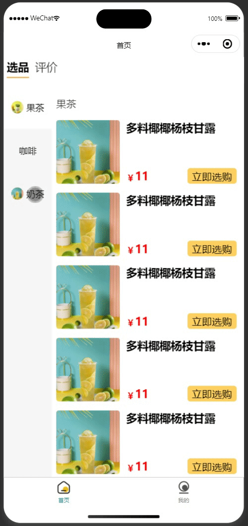
商品封面
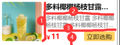
整个商品封面的布局如图2所示。可以用切蛋糕的思路去理解。①把商品切成左右两部分,②③把右侧切成上中下三部分。④把右下切成左右两部分
<template>
  <div class="qi-product">
    <!-- 封面 aspectFill优先保证图片比例 -->
    <image class="cover" :src="product.cover" mode="aspectFill"></image>
    <!-- 商品详情 -->
    <div class="info">
      <div class="name">{{ product.name }}立即选购立即选购</div>
      <div v-if="product.description" class="description">
        {{ product.description }}
      </div>
      <div v-if="product.price" class="price-row">
        <div class="price">
          <span class="prefix">¥</span>
          <span>{{ product.price }}</span>
        </div>
        <div class="choose" @click="handleChoose">立即选购</div>
      </div>
    </div>
  </div>
</template>

<script setup lang="ts">
  import {Product} from "@/typings";
  import type {PropType} from "vue";
  // 接受参数
  const props = defineProps({
    product: {type: Object as PropType<Product>, required: true},
  });
  // 定义事件
  const emit = defineEmits<{ choose: [product: Product] }>();
  const handleChoose = () => {
    emit("choose", props.product);
  };
</script>

<style lang="scss">
  .qi-product {
    padding: 15px 0;
    display: flex;
    align-items: flex-start;

    .cover {
      width: 200px;
      height: 200px;
      border-radius: 10px;
    }

    .info {
      // 撑开多余的空间
      flex: 2;
      margin-left: 20px;
      padding-right: 10px;
      display: flex;
      // 元素排列方向变为垂直
      flex-direction: column;
      // 各个元素之间在垂直方向上均衡分布
      justify-content: space-between;
      height: 200px;

      .name {
        font-size: 35px;
        font-weight: bold;
        // 文字溢出处理开始
        // 文字只能显示一行
        -webkit-line-clamp: 1;
        -webkit-box-orient: vertical;
        display: -webkit-box;
        overflow: hidden;
        // 溢出部分用 ...代替
        text-overflow: ellipsis;
        // 文字溢出处理结束
      }

      .description {
        font-size: 28px;
        color: rgba($color: #000000, $alpha: 0.7);
        -webkit-line-clamp: 2;
        -webkit-box-orient: vertical;
        display: -webkit-box;
        overflow: hidden;
        text-overflow: ellipsis;
      }

      .price-row {
        width: 100%;
        display: flex;
        // 水平方向上均衡分布
        justify-content: space-between;
        // 垂直方向居中
        align-items: center;

        .price {
          display: flex;
          // ¥ 和 数字底部对齐
          align-items: flex-end;

          .prefix {
            font-size: 28px;
            color: red;
          }

          color: red;
          font-weight: bold;
          font-size: 35px;
        }

        .choose {
          padding: 5px 15px;
          font-size: 32px;
          color: black;
          background-color: rgb(255, 209, 97);
          border-radius: 10px;
        }
      }
    }
  }
</style>
远程选择器
使用该组件可以快速的选择数据库中的数据。
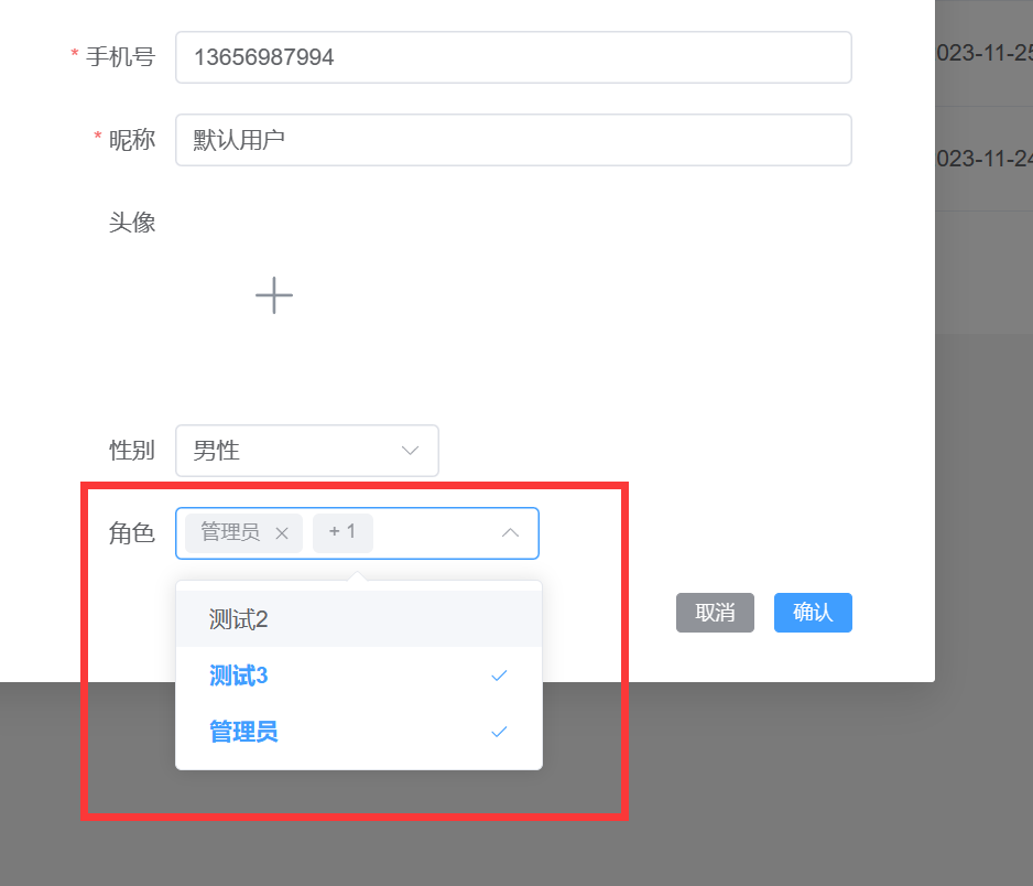
使用案例
下面的content就是需要选择的角色列表。
{
  "totalElements": 3,
  "totalPages": 1,
  "size": 10,
  "number": 0,
  "content": [
    {
      "id": "d5352808-e463-4af9-9252-6db6b7df2ca0",
      "name": "测试2"
    },
    {
      "id": "17509f5c-9a6b-429c-b467-cadbd8873d2d",
      "name": "测试3"
    },
    {
      "id": "1",
      "name": "管理员"
    }
  ]
}
roleQueryOptions:提供待选择的角色列表roleIds:已选的角色会双向绑定到该数组label-prop:根据上面的数据结构知道name可以作为el-option组件的labelvalue-prop:根据上面的数据结构知道id可以作为el-option组件的value
<script lang="ts" setup>
  const roleIds = ref<string[]>([])
  // 调用后端获取待选择的列表
  const roleQueryOptions = async (keyword: string) => {
    return (await api.roleController.query({body: {query: {name: keyword}}})).content
  }
</script>
<template>
  <remote-select
      :query-options="roleQueryOptions"
      v-model="roleIds"
      label-prop="name"
      value-prop="id"
      multiple
  >
  </remote-select>
</template>
源码解析
<script lang="ts" setup>
import { onMounted, ref } from "vue";
import { ElOption, ElSelect } from "element-plus";

export interface OptionItem {
  label: string;
  value: string;
}

const props = withDefaults(
  defineProps<{
    // 双向绑定选中的值,单向是string,多选是string[]
    modelValue: string[] | string | undefined
    // 待选项
    queryOptions: (query: string) => Promise<Record<string, any>[]>
    // 是否多选,默认false
    multiple?: boolean
    // 待选项中的哪个属性作为label
    labelProp: string
    // 待选项中的哪个属性作为value,默认是id
    valueProp?: string
  }>(),
  { multiple: false, valueProp: "id", modelValue: '' }
);
//  实现双向绑定,https://cn.vuejs.org/guide/components/v-model.html
const emit = defineEmits<{ "update:modelValue": [value: string | string[]] }>();
// 待选项
const options = ref<OptionItem[]>([]);
// 等待数据返回时要显示加载动画
const loading = ref(false);
const remoteMethod = (keyword: string, enforce: boolean = false) => {
  if (keyword || enforce) {
    loading.value = true;
    // 获取带选项
    props.queryOptions(keyword.trim()).then((res) => {
      options.value = res.map((row) => {
        return {
          // 根据映射规则得到label和value
          label: row[props.labelProp] as string,
          value: row[props.valueProp]
        } satisfies OptionItem;
      });
      // 取消加载动画
      loading.value = false;
    });
  }
};
const handleChange = (value: string[] | string) => {
  emit("update:modelValue", value);
};

onMounted(() => {
  remoteMethod("", true);
});
</script>
<template>
  <!--  el-select组件请参考 https://element-plus.gitee.io/zh-CN/component/select.html -->
  <el-select
    :model-value="modelValue"
    clearable
    collapseTags
    filterable
    :multiple="multiple"
    remote
    remote-show-suffix
    :remote-method="remoteMethod"
    :loading="loading"
    @change="handleChange"
  >
    <el-option
      :key="option.value"
      :value="option.value"
      :label="option.label"
      v-for="option in options"
    ></el-option>
  </el-select>
</template>
标签列表输入组件
标签选择器,可以添加标签,修改标签,删除标签。

<template>
  <div class="values-chose">
    <div class="values">
      <!-- 显示当内的多个值,用','连接多个值 -->
      <el-input
        class="values-show"
        size="small"
        readonly
        :model-value="props.modelValue"
      ></el-input>
    </div>
    <div class="values-input">
      <template v-for="(tag, index) in tags" :key="tag">
        <!-- 编辑值 -->
        <el-input
          v-if="editIndex === index"
          v-model="editInputValue"
          class="value value-edit"
          size="small"
          @blur="handleEditConfirm"
          @keydown.enter="handleEditConfirm"
        ></el-input>
        <!-- 显示值 -->
        <el-tag
          v-else
          class="value"
          closable
          :disable-transitions="false"
          @close="handleClose(index)"
          @click="handleEdit(index)"
          >{{ tag }}</el-tag
        >
      </template>
      <!-- 点击新增显示输入框,否则显示新增按钮  -->
      <el-input
        v-if="inputVisible"
        ref="inputRef"
        v-model="inputValue"
        class="value-input"
        size="small"
        @blur="handleInputConfirm"
        @keydown.enter="handleInputConfirm"
      ></el-input>
      <el-button v-else size="small" @click="showInput"> + 新增值 </el-button>
    </div>
  </div>
</template>
<script lang="ts" setup>
import { computed, nextTick, ref } from 'vue'
import { ElButton, ElInput, ElTag } from 'element-plus'

const props = defineProps({ modelValue: { type: Array<string>, required: false, default: '' } })
const emit = defineEmits<{ 'update:modelValue': [values: string[]] }>()

const tags = computed({
  get: () => {
    return props.modelValue ? props.modelValue : []
  },
  set: (values) => {
    emit('update:modelValue', values)
  }
})
// 编辑值
const editIndex = ref(-1)
const editInputValue = ref('')
// 点击值标签,显示输入框编辑值
const handleEdit = (index: number) => {
  editInputValue.value = tags.value[index]
  editIndex.value = index
}
// 编辑值输入框确认
const handleEditConfirm = () => {
  if (editInputValue.value === tags.value[editIndex.value]) {
    return
  }
  tags.value[editIndex.value] = editInputValue.value
  tags.value = [...tags.value]
  editIndex.value = -1
}
// 点击值标签的右上角触发删除值
const handleClose = (index: number) => {
  tags.value.splice(index, 1)
  tags.value = [...tags.value]
}

// 新增值
const inputRef = ref<InstanceType<typeof ElInput>>()
const inputVisible = ref(false)
const inputValue = ref('')
const handleInputConfirm = () => {
  if (inputValue.value) {
    tags.value = [...tags.value, inputValue.value]
  }
  inputVisible.value = false
  inputValue.value = ''
}
const showInput = () => {
  inputVisible.value = true
  nextTick(() => {
    if (inputRef.value && inputRef.value.input) {
      inputRef.value.input.focus()
    }
  })
}
</script>

<style lang="scss" scoped>
.values {
  display: flex;
  justify-content: flex-start;

  .values-show {
    width: 100px;
  }
}

.values-input {
  margin-top: 10px;
  display: flex;
  align-items: center;
  flex-wrap: wrap;
  margin-bottom: 10px;
  .value-edit {
    width: 100px;
  }

  .value {
    margin-right: 5px;
  }

  .value-input {
    width: 100px;
  }
}
</style>
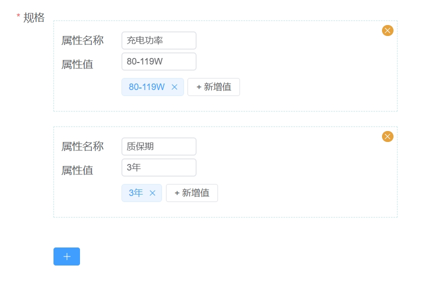
键值对输入组件
<template>
  <div class="key-value-section">
    <div class="key-value-wrapper" v-for="(keyValue, index) in keyValueList" :key="index">
      <el-button
        class="close-btn"
        type="warning"
        size="small"
        circle
        @click="deleteKeyValue(index)"
      >
        <el-icon>
          <close></close>
        </el-icon>
      </el-button>
      <el-form label-width="80" label-position="left">
        <el-form-item label="键名称">
          <el-input style="width: 100px" v-model="keyValueList[index].name" size="small">
          </el-input>
        </el-form-item>
        <el-form-item label="值列表">
          <value-input v-model="keyValueList[index].values"></value-input>
        </el-form-item>
      </el-form>
    </div>
    <el-button type="primary" size="small" class="plus" @click="addKeyValue">
      <el-icon>
        <plus></plus>
      </el-icon>
    </el-button>
  </div>
</template>

<script setup lang="ts">
import { ref, watch } from 'vue'
import { Close, Plus } from '@element-plus/icons-vue'
import ValueInput from './value-input.vue'
import type { KeyValue } from '@/apis/__generated/model/static'

const props = defineProps<{ modelValue?: KeyValue[] }>()
const emit = defineEmits<{
  change: [data: KeyValue[]]
  'update:modelValue': [data: KeyValue[]]
}>()
const keyValueList = ref<KeyValue[]>([])
const deleteKeyValue = (index: number) => {
  keyValueList.value.splice(index, 1)
}
const addKeyValue = () => {
  keyValueList.value.push({
    name: '',
    values: []
  })
}
watch(
  () => props.modelValue,
  (newValue) => {
    if (newValue) {
      keyValueList.value = newValue
    }
  }
)
watch(
  () => keyValueList.value,
  () => {
    emit('update:modelValue', keyValueList.value)
  },
  { deep: true }
)
</script>

<style lang="scss" scoped>
.key-value-section {
  width: 100%;
  .plus {
    margin-top: 20px;
  }
  .key-value-wrapper {
    margin-bottom: 20px;
    border: rgba(114, 207, 222, 0.5) 1px dashed;
    padding: 10px;
    position: relative;
    margin-top: 20px;
    .close-btn {
      position: absolute;
      top: 5px;
      right: 5px;
      width: 15px;
      height: 15px;
    }
  }
}
</style>